
creating a brand color palette can be pretty daunting but don’t worry, I’m gonna help you figure it out and get to know your brand a little better!
step #1 – create a mood board
so, the first step to making your brand color palette is to create a mood board. a mood board is basically just a bunch of images that will help to give you an idea of what your brand looks and feels like.
when I put together mood boards I use a handy little site called Figma – https://www.figma.com/. this makes creating mood boards super easy. I’m also a hugeeeee (HUGE !!) fan of pinterest so I use that to collect images but you can use whatever you want – it’s your brand after all!
your mood board should help you define the vibe of your brand and get a feel for what you want your brand to convey.
images you’ll need to get…
- home exterior
- landscape
- color
- outfit
- quote
- tattoo
- living room
- aesthetic
- pair of shoes

(here’s mine!)
head to pinterest and collect a bunch of images for each point that you feel best represents your brand. once you have all your images, fill the rest of the board with some extra pics that match the vibe!
also. a little top tip… make sure you’re picking images that actually represent your brand and not just images that you like. I like a zillion things but if they don’t represent my brand they’re not going to work. you need to narrow it down to things that match both your likes and your brand representation.

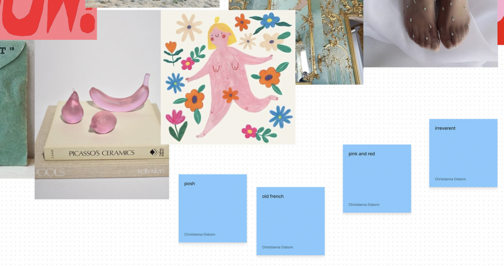
(here’s what my final mood board looks like!)
step #2 – define what you see
now that you’ve gathered all your gorgeous images, you need to define what you can see on your mood board. pick out common colours, styles, themes, whatever it is you can see and note down words to describe it. in my case, I picked words like ‘pink and red’ and ‘old french’.
“Life is a painting, and you are the artist. You have on your palette all the colors in the spectrum – the same ones available to Michaelangelo and DaVinci.” – Paul J. Meyer
step #3 – pick colors out
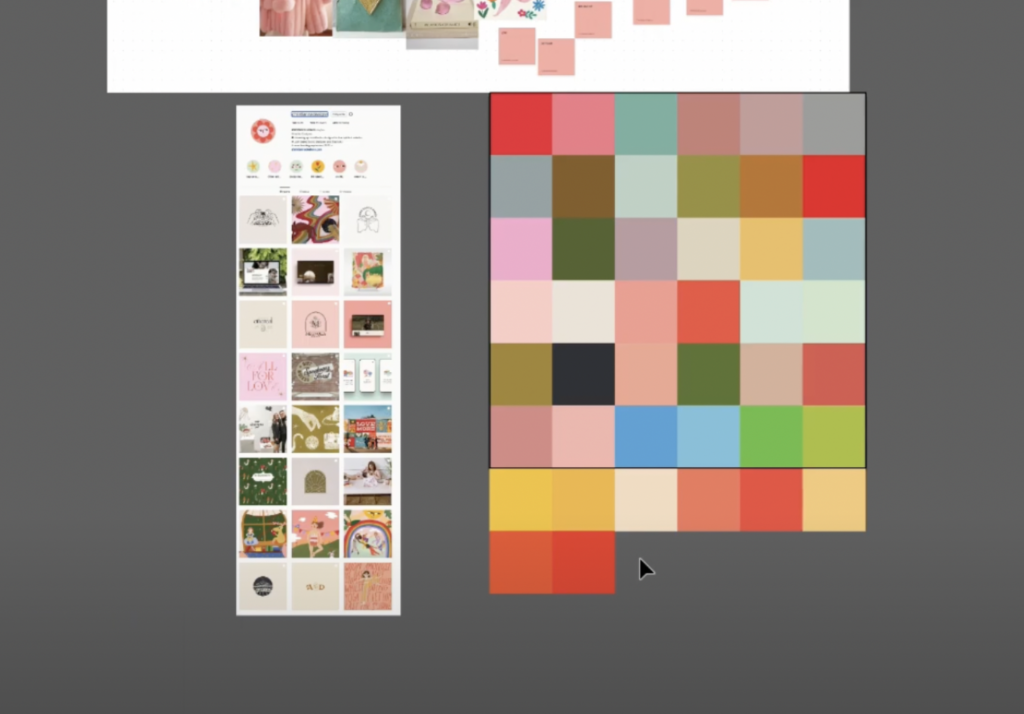
you’ve killed it, you’ve got your mood board ready, it’s time to start picking out some colors for your brand color palette! this part of the process is super fun and really easy. all you’re gonna need to to do is take a screenshot of your mood board (command + shift + 4 for mac, or windows + shift + s for windows), hop onto adobe illustrator, and create a bunch of little squares. these squares are your potential brand color palette’s swatches, so you’re going to steal colors from different parts of your images using the eyedropper tool and pop them on your squares.
to get a better feel of what themes and colors you’ve already gravitated towards with your brand, head to instagram and screenshot your feed. see if you you can draw upon some of the themes you already have going on there and do the same as you did with your mood board – screenshot and eyedropper tool to create your color swatches.
step #4 – top secret step
step 4 is my little secret to creating the perfect brand color palette, so keep this one to yourself… who are kidding you aint gonna keep this to yourself 😉
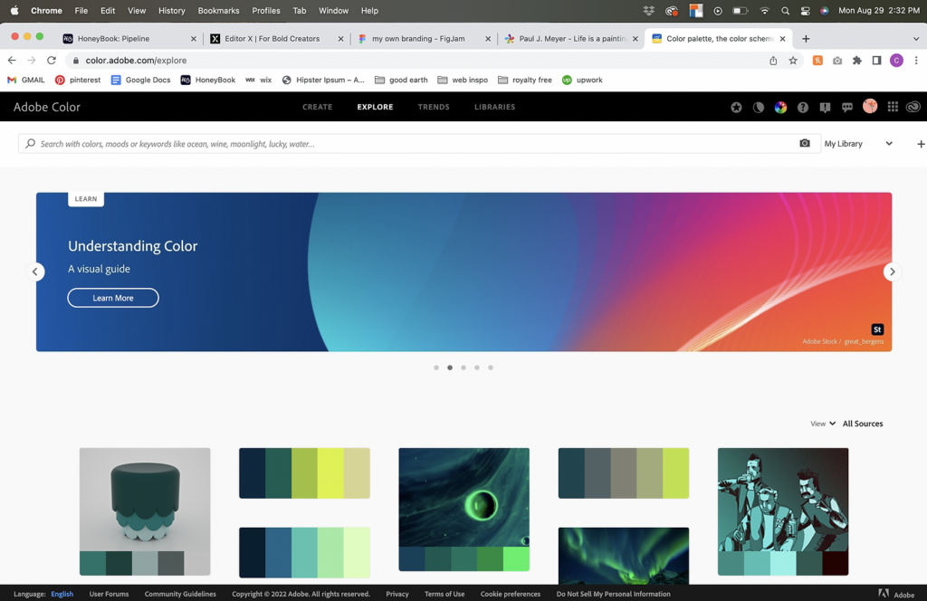
remember the words you noted down to describe your mood board? all you’re gonna do is take these words to a magical little website – https://color.adobe.com/explore and type them in the search bar one at a time. it’ll give you a bunch of colors to work with that match the term you entered (it’s super handy!) pick out any of the colors that stand out to you and add all the good ones to your adobe illustrator board.
step #5 – sort yo colors
right now you’ve probably got a TON of colors so its time to narrow it down. group all the reds, blues, oranges, greens, purples… whatever colors you have, get em grouped together. once you’ve done that, start pairing up the colors that look similar to each other and get rid of your least favourite out of the pair. do this till you’re left with one – you’re fav. once you have all your colors narrowed down, you’ll be left with several colors that will make up a dope brand color palette! but… you’re not done jussstttt yet.
step #6 – create a brand color palette hierarchy
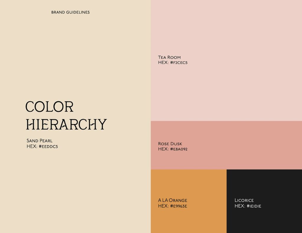
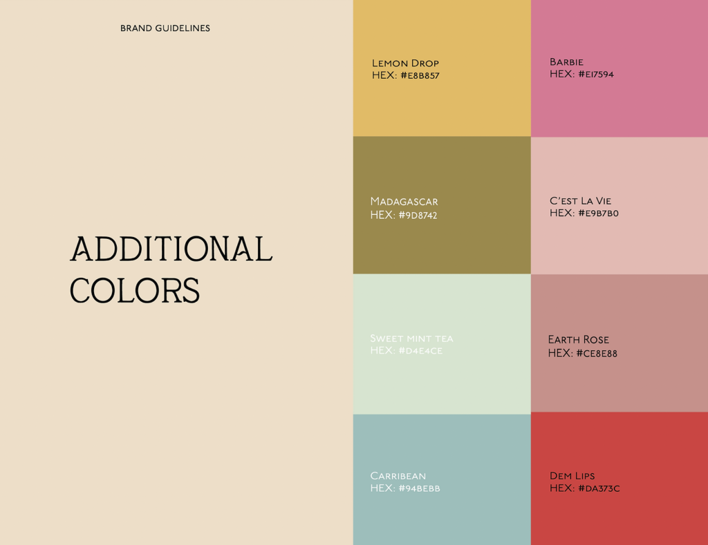
the final step is to create a color hierarchy. this will help separate your brand color palette into your main (primary) colors and your additional (secondary) colors. your main colors will the be the ones that appear across the majority of you website, business cards, emails, and whatever else you’re going to be using. your secondary colors can be used to compliment your primary colors or be used to highlight things like buttons on your website to make them super obvious.
step #7 – create color names
this step is an optional extra and not completely necessary (I just like to do it because i’m extra hehe) but it can be pretty helpful too!
I go to a website called https://colornamer.robertcooper.me/, grab a hex code from my brand color palette and pop it into the website. whoever this robert dude is, will give you a good name for your color!
go get your brand out there
you’ve got your brand color palette sorted so it’s time to use it! get your brand out there you can use your colors wherever your heart desires – business cards, website, social media, emails, merchandise, advertising… the list is truly endless.
it’s important to remember that brand identity is an essential part of your business, and a brand color palette will help you keep your branding consistent. not only will this help make your brand more recognizable, but it will also help provide a sense of trust with your audience!
christianna designs © 2023 | all rights reserved | site copy by emma parnell | photography by olivia dotson | christiannadesigns@gmail.com
